The ideal cover for your Facebook page. Practical tips
Your photo on the Facebook cover is one of the first things people see when they visit your Facebook page. That’s why it’s crucial to make the best possible first impression and accurately convey what you aim for through the cover photo.
Although it sounds simple, we’ve found that it can be quite challenging! Nevertheless, don’t worry, we’re here to help you. Let’s go through together the best way to make the most effective use of your photo for the Facebook cover.
So, today we will do three things:
- Introduce you to Facebook cover photos and their ideal sizes;
- Provide you with a guide on how to create a cover photo and choose the perfect image;
- Show examples of Facebook pages with brilliant cover photos.
PHOTO SIZE FOR FACEBOOK COVER
Let’s start with a brief overview of cover photos and the optimal size for use…
This is the perfect size for your page cover, but of course, it may vary.
According to Facebook, your cover photo:
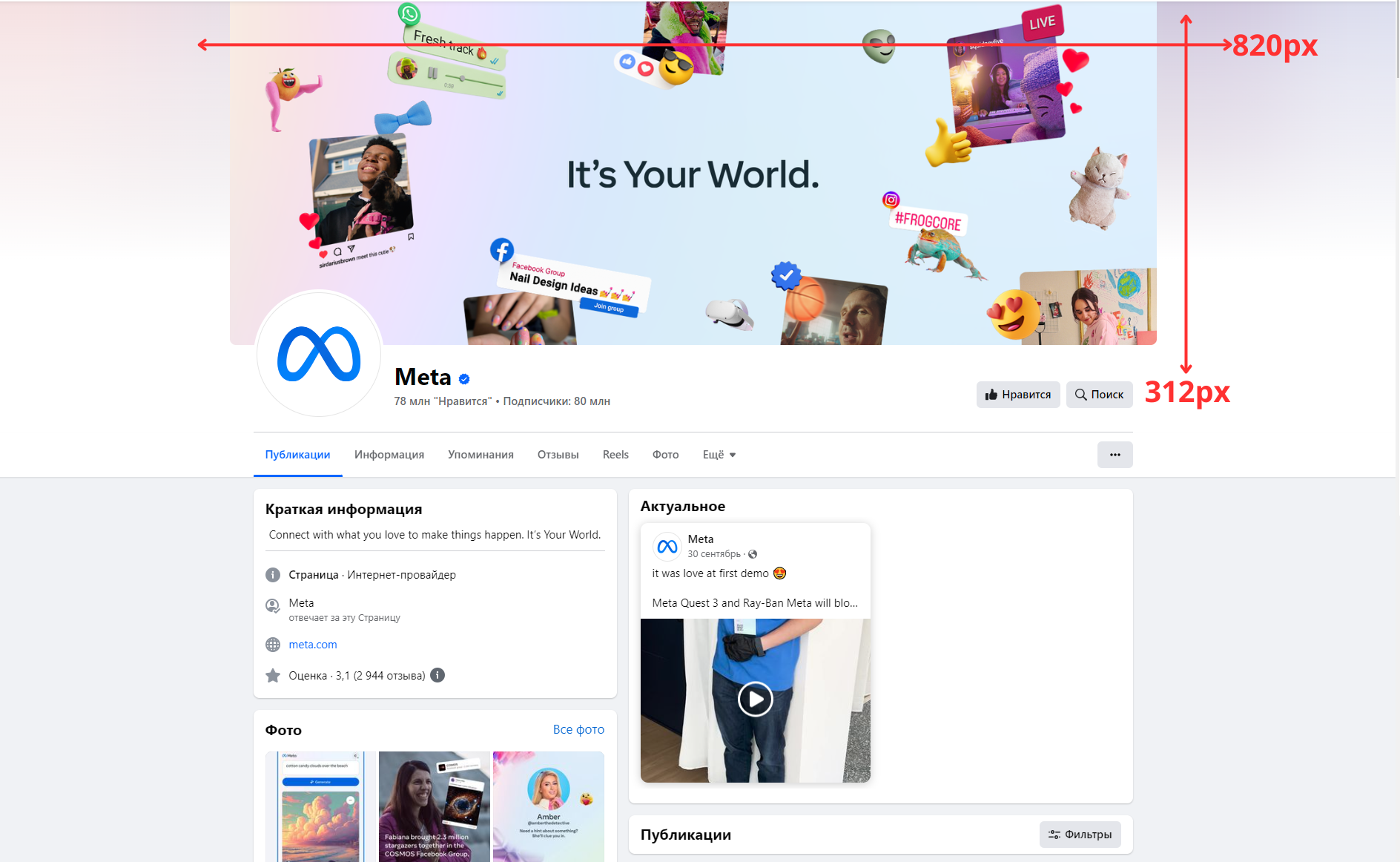
- Has 820 pixels width and 312 pixels height when viewed on computers, and 640 pixels width and 360 pixels height when viewed on smartphones.
- Does not display on feature phones.
- Must be at least 399 pixels wide and 150 pixels tall.
- Loads fastest as an sRGB JPG file with a width of 851 pixels, height of 315 pixels, and a size of less than 100 kilobytes.
So, what does all this mean?
It means that even though we upload only one photo, Facebook will use it in two different ways:
- In a rectangular format, 820 pixels wide and 312 pixels tall, for PC monitors,
- And in a slightly more square format, 640 pixels wide and 360 pixels tall, for mobile devices.
VIDEO COVER FOR YOUR PAGE
Now you can use a video instead of a static cover. With a video, you can share more about your business and tell a longer story.
Key requirements for a video cover:
- It must be at least 820 pixels wide and 312 pixels tall.
- Its duration can range from 20 to 90 seconds.
Our advice: If you find an image or video you like, and its dimensions are slightly exceeded, you can still use it! You select or upload the image or video, and then you’ll be allowed to “Edit” its position. Thanks to the editing feature, Facebook essentially allows you to crop your cover so that it fits the space as you see fit.
PC MONITORS VS MOBILE PHONES
It’s crucial never to forget that cover photos on a Facebook page look different on monitors and mobile devices.
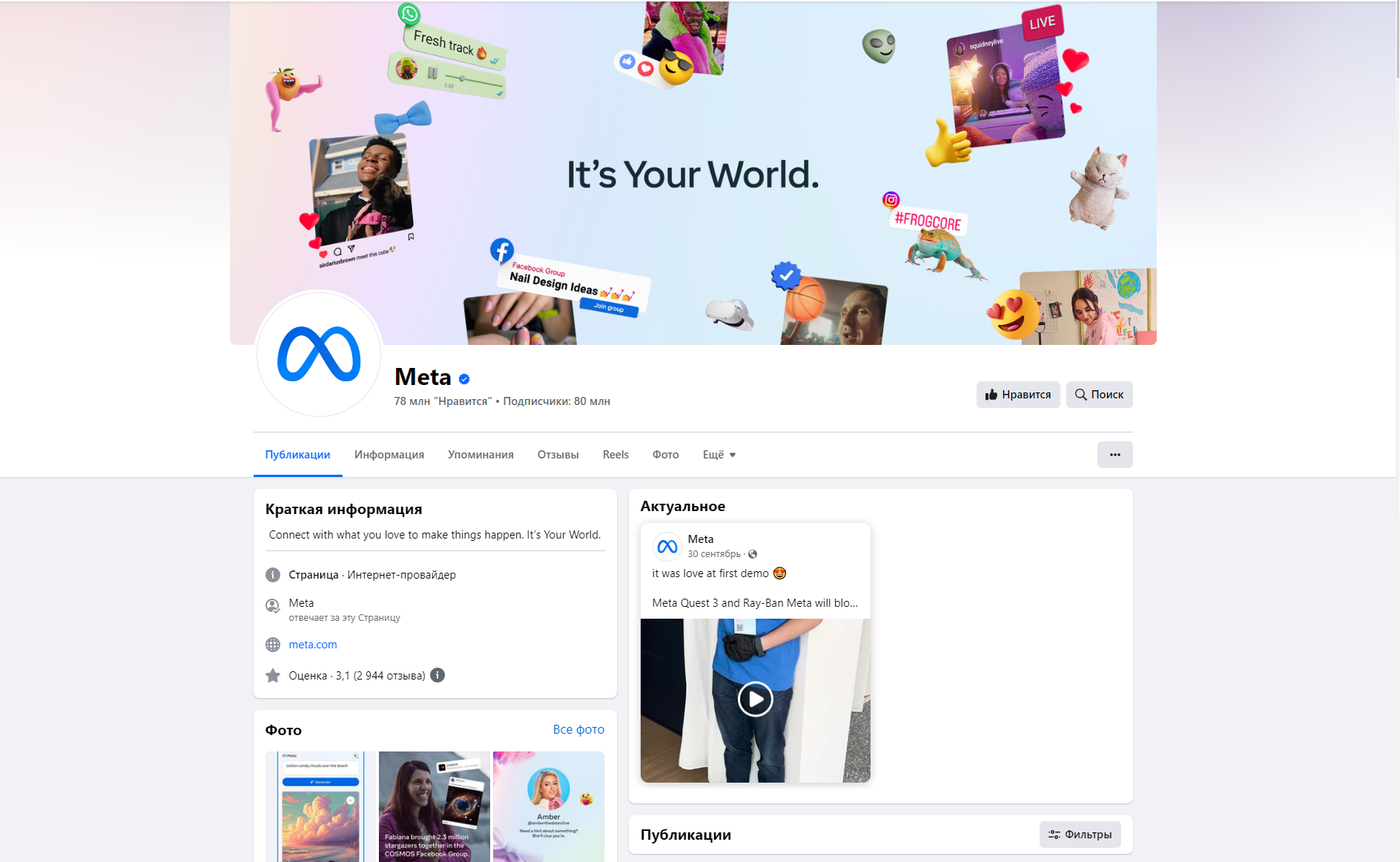
For instance, here’s how a cover looks on a desktop: Facebook cover photo on a computer.
And here’s how it looks in the Facebook mobile app: Facebook cover photo on a mobile phone.

At first glance, they appear the same, but there’s a slight difference:

On a mobile phone, the top and bottom parts are slightly expanded – by 75 pixels each, to be precise – assuming you haven’t adjusted the position of the photo. The elements highlighted in red are not visible on your page when viewed from a computer.
The cool thing is that Facebook doesn’t stretch or compress the same image; they adjust the cropping. This is fantastic because it ensures that your image will look its best without any distortions.
IMAGE SIZE FOR COMPUTER MONITORS
With the new design of the Facebook page, everything that used to be on top of your cover photo (such as your profile picture, page name, “Like” button, etc.) is moved out of the cover – voila!
For personal Facebook profiles, your profile picture, your name, and a few buttons still overlay the cover.
DOUBLE-CHECK YOUR COVER DESIGN ON MOBILE DEVICES
If you’re using text on your cover, such as a Call to Action (CTA), you’ll want to switch to the Facebook mobile app quickly to ensure that everything looks good. For example, if your cover photo is not tall enough, the sides of your photo (or some characters of your CTA) may be cropped on the mobile app.
HOW AND WHERE TO CREATE A BEAUTIFUL FACEBOOK COVER?
You can either download or create an original image for your Facebook cover to make it stand out.
OPTION 1 – DOWNLOAD IMAGES OR READY-MADE COVERS FOR FACEBOOK.
If you’re looking for free images to create a ready-made cover for your Facebook page, there are resources where you can find images free to use. Here are a few such resources:
- Unsplash (https://unsplash.com): Unsplash provides free high-quality photos that can be used for any purpose, including creating covers for social media.
- Pexels (https://www.pexels.com): Pexels also offers a large collection of free photos for your creative projects.
- Pixabay (https://pixabay.com/): Pixabay also provides a wide selection of free images available for use without licensing restrictions.
When using any images, make sure you have the right to use them, especially if they will be used for commercial purposes.
OPTION 2 – CREATE OR MODIFY A DOWNLOADED FACEBOOK COVER.
Use Photoshop or another visual editor. In the first option, we mentioned websites with PSD files suitable for Photoshop.
Canva
A simple, user-friendly, and free online graphic editor. It’s perfect for creating a beautiful and original Facebook cover. In Canva, you’ll find numerous pre-designed templates. There are also plenty of additional elements, images, icons, and text to quickly and beautifully create a cover. All templates are already standardized to the Facebook cover size.
Designbold
Another simple and free online photo editor with more free images and icons than Canva. However, Cyrillic fonts are not available, and in the free version, you can download only 5 photos per month. But that’s usually enough to nicely design one Facebook cover.


PS. Photoshop, Canva, and Designbold will also help you easily resize any image to fit perfectly into the required dimensions for a Facebook cover.
Moreover, you can always combine these tools. For instance, create a beautiful template using Designbold and then add text to it in Canva or Photoshop.
YOUR FACEBOOK COVER
Now that we know how to create your cover, the question is, what photo should you choose for your cover? Let’s explore some top tips.
TIPS FOR YOUR COVER
First and foremost, when it comes to a Facebook cover photo, let’s discuss some of the best practices. We’ve compiled a great list of Do’s and Don’ts when it comes to cover photos. Here are some key points:
- Follow Facebook’s recommendations.
- Adhere to the dimensions required by Facebook (820 pixels wide by 312 pixels tall for desktop computers).
- Don’t forget about how your cover photo will look on mobile devices.
- Create a cover photo in a consistent design with the rest of your page.

WHAT COVERS ATTRACT ATTENTION?
We’ve covered some elements that make any image engaging, and photos can be shared with others based on these:
- Emotion: Evoking feelings to prompt action.
- Relevance: Including something that aligns with your audience’s interests.
- Colors: Choosing the right colors that encourage sharing.
- Typography: Choosing the right font that makes your message clear.
- Hashtags and Text: Finding the right words that encourage audience interaction.
These elements can also be applied to your Facebook cover photo, making people feel a certain way or take specific actions when they visit your page.
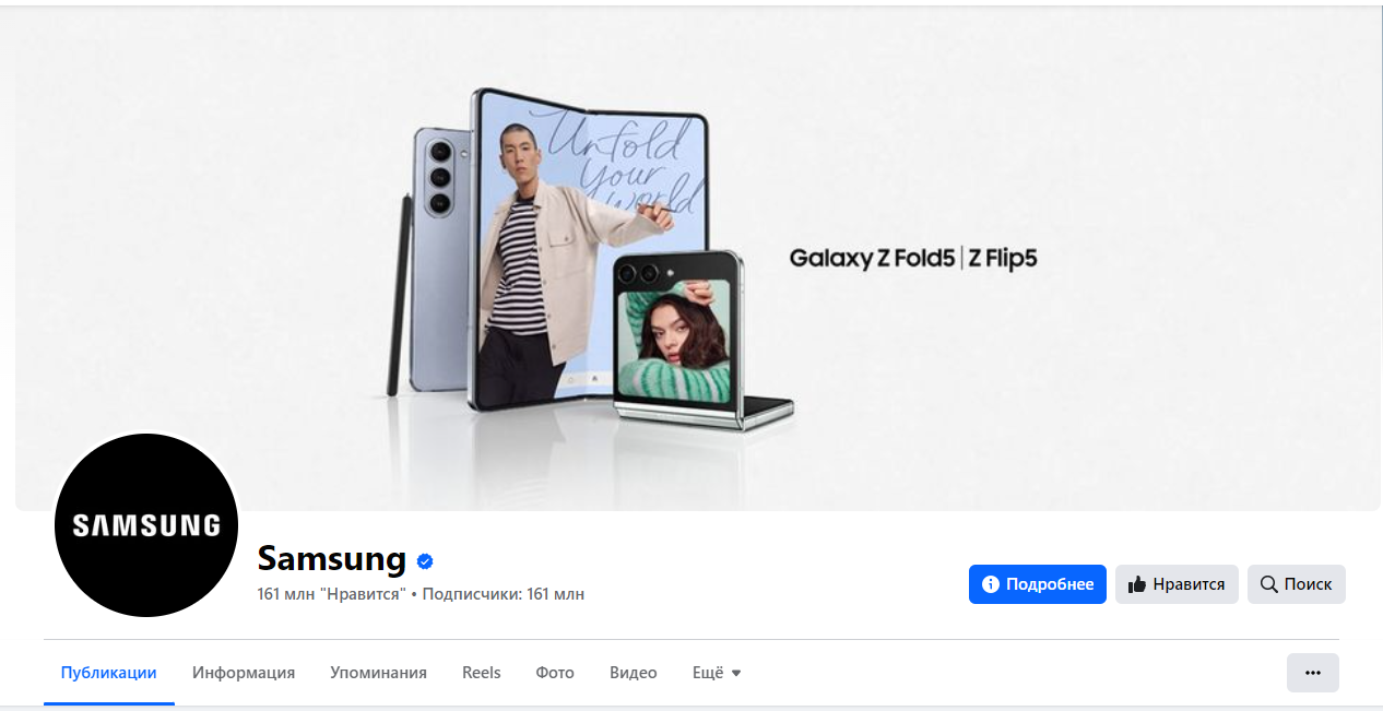
For example, Coca-Cola’s cover photo depicts several happy young people clinking their soda bottles. Presumably, this instills the hope that such an action can make people feel happy, associating drinking Coca-Cola with happiness in people’s minds. Simple and effective.

WHERE DO PEOPLE LOOK?
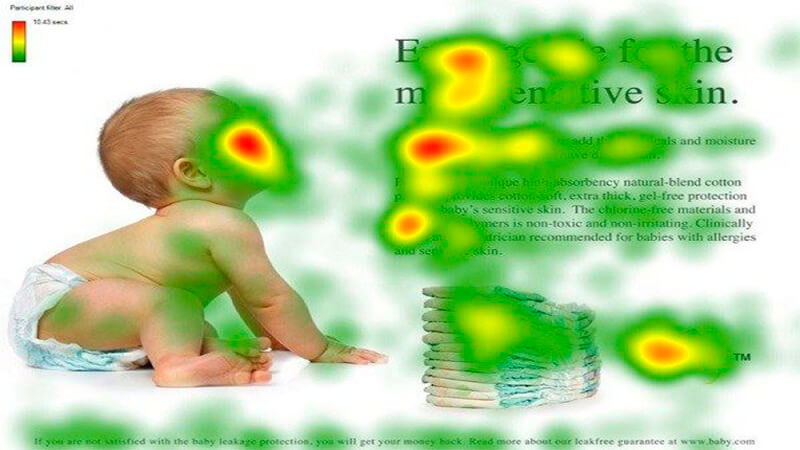
When you come up with your perfect cover photo, we recommend looking at interesting eye-tracking studies. Web analytics experts at Kissmetrics identified a concept called “visual hierarchy.”
It was found that if you want to draw attention to a specific element of an image, a visual hierarchy resembling a person’s gaze looking at that object will guide viewers to what they should look at next. This can be an intriguing way to utilize a person’s gaze in your Facebook cover photo
UNCONVENTIONAL APPROACH
Your cover photo is a great way to express yourself and attract attention to your page visitors. Here are several ways you can use for your cover:
- Use your cover to promote your social media campaigns.
- Make sure to change your cover on special occasions – promotions, holidays, company anniversaries, etc.
- Utilize your cover to engage with your visitors. Encourage them to:
- Like your page.
- Share your page.
- Use bold slogans (sales, important events) on your page’s cover.
- Use videos for your cover. A page with a video cover won’t go unnoticed.
Now that we know how to create the perfect Facebook cover photo, how about taking a look at some pages that do it well? Hopefully, you can find inspiration.
